Monday, August 16, 2010

Illostribute - John Held Jr


Here is my next submission for the collaborative illustration blog Illostribute.com . The idea is to honor master illustrators and fine artists by investigating their work, through interpretation. After researching the chosen artists work, each contributing illustrator is to respond by creating their own piece of art, inspired by the work of the referenced artist.

The second master illustrator that was selected for this project was the ever inspiring John held Jr. His work is fun and timeless, and you can read more about him HERE , and below I've posted a few of his pieces which I referenced for my inspired painting.


In referencing John Held Jr's work, I fell in love with his simple use of shape, space, character and story. I love the way he focuses on illustrating what's important to the illustration, while removing everything that is un-necessary from the concept. A perfect example is his piece with the kids playing miniature golf. Only the kids, golf clubs, and graphic sections of the putting green are illustrated, and everything else in the scene is left out. Graphically I find this to be a really bold and interesting way of depicting such a scene, and that's what I found my self inspired by.

In my piece I started with two simple rectangles, one yellow, and one brown. Adding the window, the checkered boxes, and the two red dots on the yellow rectangle on the left, helped me convert an otherwise boring yellow space into a graphic and stylized representation of a taxi cab. Adding in the characters to the piece now tells the story of a man in a taxi cab pulling up next to a lady walking down the street. Finally I played on the way the old "Life" magazines often referenced the word "Number" in their title for each issue. In the few I looked at, the titles read "Radio Number" & "Automobile Number," so to help sell the concept of my piece, I titled mine "Getting Her Number" as a reference to what the man in the taxi cab's reason was for approaching the woman on the street.

Getting Her Number
6" x 8"
Digital
2010
Piece inspired by John Held Jr.

Monday, August 09, 2010

Yeti Swap


One of my favorite artists / designers working today is Don Clark, half of the amazing Clark duo that makes up the awesome Seattle based Invisible Creature Design/Illustrations Shop. If you are in need of some inspiration and would like to see some awesome design work, swing by and check out their killer site.

As for the trade, a long time ago, Don and I decided that because we both share an equal love for the Legendary Ice Beast that is the Yeti, that we would partake in a ceremonial trading of the Yeti's. Below you can see my contribution to the swap on the left, and on the right, is Don's Bad Ass contribution to the trade, which hangs proudly in my home studio.

My concept for the trade was simply letting the Yeti and some of his cold weather friends take a bit of a break from the snow to enjoy some drinks and much needed sunshine.

Next Year - Swap of the Sasquatch! Can't wait.

A closer look

Don's Yeti:
Freddy Mushyeti
17" x 23"
Digital
2010


My Yeti:
A Break from the Snow
10" x 16"
Acrylic & Paper Collage
2010

I'm featured on WIRED in Italy


A little while back, the Italian branch of the magazine WIRED asked me if they could post some of my work in one of their online artist galleries. The artists they are showcasing are pretty diverse, so it's a cool place to see a wide range of work. Here is the LINK to see the work, and since I don't speak Italian, I'm not really sure what they are saying about it, hopefully it's good.

The piece above:
3-Desire The Night
featured in the Ancient Book of Sex And Science
Acrylic & Paper Collage
2009

Wednesday, August 04, 2010

Good Cop , Bad Cop


Just a little painting for a little fun!

Good Cop, Bad Cop
Acrylic & Paper Collage
5" x 5"
2010

Friday, July 23, 2010

She & Him Concert


Recently my wife Crystal and I went to the She & Him concert here in L.A. at the Hollywood Bowl and it was awesome. Joined at the concert by our good friend Sam Marin, we are huge fans of the band and it was a blast getting to see them perform live. She ( Zoe ) sang great, and Him (M.Ward) killed it on the guitar. Anyways, I really love concert poster design, so I thought I would throw a little something together to help remember the show, so I made this little "mock" concert poster. I kept this poster simple, and just drew the simple caricatures of the band from memory. My hope is from here on out, every show Crystal and I go to, I'm gonna try and make a little tribute concert poster to go along with the memories.

Wednesday, July 14, 2010

Ed Emberley Tribute


Growing up, I didn't know it, but Ed Emberley was one of my favorite artists. As a kid I had several of his books, and I have to say he was one of my first artistic inspirations. I used to love to draw from his books, follow the steps, use all the fun shapes, and adding all the detail at the end was my favorite part. One of the things I love about Ed Emberley's work is the way he designed his characters off such simple shapes. It's one of the first things that I think we all learn and do as designers when we are working on a character design, or thinking about structuring a layout drawing for a background. Start simple, and play with simple shapes to help vary your design, then go from there. Anyways, even though I haven't thought of Ed Emberely's work for a little while, his whimsical design principles thankfully are permanently burned into my brain and it wasn't until I saw this post on Cartoon Brew today about a gallery showcasing some work as a tribute to him, that I stopped to take a look back at his work, and reflect on the influence his style and artwork had on me as a young artist.

I'm not part of the gallery opening, but I felt compelled today to illustrate a Sasquatch inspired by Emberley's style ( shown above ) and in true Emberley fashion, I illustrated the steps on how to draw this particular Sasquatch. For anyone who either wants to follow the steps bellow, or has kids who would like to create this Sasquatch from the steps below, go for it! and email me a scan of your piece and I'll post it here on my blog. My only request for those interested would be to follow the steps on real paper with marker, pencil or preferably crayon!


Two great artisists in Trip Park and Amy Mebberson showed their love for Mr. Emberley's work by contributing to this post with their awesome work below.


Here are a few images of Embereley's amazing work I grabbed off the internet. To read more about him click HERE , or head over HERE to buy his books online.

Tuesday, July 06, 2010

Interview on Sketchaholic.com


Recently, I was interviewed by the great Bobby Chiu on his website Sketchoholic.com . Some of the things covered in the interview was my character design contribution to the new film Toy Story 3. If you wanna check out the interview you can see it HERE . For those of you who are new to the Sketchoholic website, here is a little run down of what you can expect to find there:

Sketchoholic.com is where animation artist Bobby Chiu broadcasts live interviews with artists in the animation, film and illustration industry and asks them to share their thoughts and beliefs about art. On other occasions, Bobby also conducts contests where he paints live and encourages people to paint along with him. Winning submissions wins some original art. The site is free to join, just head HERE to do so.

Bobby had asked me to hold a short contest of my own as well for my interview. My contest was to draw/design/create a "Wall Street Cyclops" basically a Cyclops investment banker. The submissions into the contest were awesome! Everyone really blew me away with how many unique, fun and creative ways they apporached the design challenge. You can see the submissions on the page Bobby set up for my interview HERE .

All in all, Bobby has set up a really fun and informative website at Sketchoholic.com. There are tons of great interviews that can be found all over the site with some of the most talented and inspiring artists working today. And in addition to all the great interviews on the site, the drawing/design contests that Bobby holds on the site are a particular favorite of mine, as I love spontaneous character design challenges.

Below is my good friend Austin Madison's contribution to the contest, I just love the putting green and the blue tooth ear piece!


Details on my piece below

Wall Street Cyclops
5" x 7"
Acrylic, Paper Collage & Cold Hard Cash
2010

Tuesday, June 29, 2010

Toy Story 3

Now that Toy Story 3 has been released, I thought I'd post some of the character design work I did on the film. Working on the film as a character designer was a dream come true for me. I came on early on the project and had an opportunity to work on a whole bunch of different characters which was a blast. I also had the chance to work with a great art team on the film ( Bob Pauley Production Designer, Dice Tsutsumi & Robert Kondo as Art Directors, Craig Foster Graphic Designer ) just to name a few. And I also can't leave out everyone else on the art team all of which were some of the most talented individuals I've ever worked with, and lucky for me, the crew for the entire film was just as awesome.

Daniel Arriaga, Tom Gately, Dan Holland, and Daniela Strijleva rounded out the character art team with me, and they all were not only inspiring to be around, but brought so much enegry and creativity to the character design process of the film, that it was just exciting to be around. Lee Unkrich our director was awesome as was our Producer Darla Anderson. I also have to tip my hat to the entire TS3 story team, they really paved the way for us character designers to have a ton of fun and really succeed. I can't remember all their names, but their team really set the tone for the movie, and their creativity and character/story concepts are behind every character you see in the film. They all did a spectacular job.

While I worked on more than you'll see here, I thought I'd post some stuff from the characters that were not only new original characters to the franchise, but ones I had the most influence on. Below is a collection of some of the work I did for the film.

Mr. PRICKLEPANTS

Mr. Pricklepants was one of the first characters I had the chance to work on. When I first came on to the show, I was assigned to begin working out the designs for Bonnie's toys. Pricklepants being the esteemed actor and thespian that he was, he was hilarious from day one and he definitely stole the show in the story boards which made my job as a designer pretty easy. As far as his design goes, I thought of him as sort of a stocky little bean bag toy you might find in an airport or something. Below are a few other sketches I did while exploring his bean bag/gum drop shape, style, and outfits.


BUTTERCUP


Buttercup is another one of Bonnie's toys. Most of the work that went into Buttercups design was to try and make him the cutest little unicorn the universe had ever seen. One thing I thought that was really helpful in working out his design was referencing pictures of real horses to see how they moved. And using that reference to help figure out how much of that natural movement would translate into the movement of a little plush horse. Below you can see some of those sketches I did to help figure out his movement and shape.


I included the sketch below as it was the first sketch I ever did of Buttercup, at one point we thought he might have long flowing hair.


DOLLY


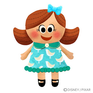
Dolly is another one of Bonnie's toys, and from the first time I started designing on here, Lee always thought of here has a flat little home-made looking doll, so that's where we started. In the early stages she looked as she is above. I wanted her to be the perfect definition of a cute little girl, so I referenced pictures of my wife when she was little (as she was seriously the cutest little girl their ever was) and put a lot of her into my design. I always thought of her as having cute little pattern dresses and her hair parted to one side with stylized little bangs and maybe a bow or bumble bee hair clip. Below are a few more variations I did on working out differences in her hair style and dress patterns and colors.


CHUCKLES


Chuckles was another character that really stole the show in the story boards. The artist who boarded him, really nailed the "worn out clown toy" look, so I just followed his lead and tried not to screw up his concept. Chuckles was a blast to work on, because in the film he's so broken, so down, and the fact that he's a clown just always came across as so dark to me and I couldn't help but fall in love with his character. Below are a few sketches I did on his movement, which should really just be called a "waddle." And a few other early concepts of his look.

One thing that was particularly challenging about working on him, as were a few of the other bad guys was, these toys weren't made to look evil, creepy, or mean, so we had to design them with the concept that they were made to look cute and fun as you would buy them in the store, but could have the proper look that could give them the dark edge they would need as characters.


THE ROBOT


The Robot was a character that was originally in Bonnie's group, but didn't end up making the cut. I worked on him for a while, and the concept behind his design was that he was a cute little battery operated learning robot. Below are a few other takes I had on him.


OTHER BONNIES TOYS CONCEPTS

For a while, we played with the thought that Bonnie might either be making some of her own toys, or simply just have some hand made toys. These were particularly fun to work on as I just had a blast drawing a whole bunch of funny little hand made characters. I thought it might be particularly fun to play up their hand made feel by making them noticeably un-even in their design which I also thought played up their charm and silliness.

We also played with concepts of her having toys that were possibly shaped as veggies, fruits, or deserts.


Two characters I pined for were the tooth and the Popsicle. I thought of the Tooth as maybe something she got from her first visit to the dentist and the Popsicle just a funny little hand made craft guy made of felt and Popsicle sticks. To me they seemed like the perfect odd couple, the Tooth disliking the Popsicle for his carelessness when it came to health and sweets and all things responsible, and the Popsicle just being the sweet life of the party with not a care in the world.


Below are a few other quick sketches of hand made/craft toys Bonnie may have either made or just had lying around.


STRETCH


Stretch was one of the first characters I worked on in Lotso's Gang. It was fun to get to design a bad guy for a change, and it was also fun because his design evolved for a little while thought the process of finding out what type of character he would be. I originally thought it would be funny if he was some sort of water toy 9 thus the silly little sailor hat above ) but we ended up ditching that, and pushing him to a creepier design as seen below.


below are a few other sketches and passes at different variations of his face both happy and mean.


THE LIBRARIAN

Below are some sketches I did as we were trying to figure out what type of light up worm would he be. I have a painted final design and quick sculpt I did which I'll post tomorrow once I find them. But for now you can see the beginning part of the process with him.


THE "METAL HEAD" GARBAGE MAN


I didn't really get a chance to work on any of the humans in the film, except for the bad ass head banging garbage guy. Not too much work went into his design process, we tried to keep him pretty generic, but accessorize him with everything a metal head would need to be jamming out while picking up the trash. For a short assignment, I had a fun time sketching him in his head banging ways.


ANDY'S ROOM GRAPHICS

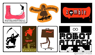
One of my first assignments on the film was to begin to develop some stickers / posters that teenage Andy might have in his room. Not sure if any of these made it into the final design of his room, but none the less, I had fun making some skateboarding stickers and graphics so I thought I'd share a few.
Monday, June 21, 2010

J.C. Leyendecker


I was recently asked to participate in the new blog Illostribute.com . Illostribute is a new collaborative illustration blog, conceived and edited by illustrator & artist Toby Thane Neighbors . The idea is to honor master illustrators (and occasionally fine artists) by seriously investigating their work, through interpretation.

The first master artist that was selected for this project was the amazing J.C. Leyendecker. His work is beautiful and elegant, and you can read more about him HERE , and below I've posted a few of his pieces which I referenced for my inspired painting.


As for my piece inspired by Leyendecker's work, what I focused on was his bold graphic concept of letting everything in black fall away, only relying on lighter objects in the piece to tell the story in the painting. I love how limited yet very descriptive this technique is that he occasionally used and so I thought I'd explore that concept in my piece inspired by his work.

Drinks With Leyendecker
Acrylic & Paper Collage
8" x 10"
2010

Friday, June 18, 2010

Guilty Insomniac


Here is my contribution to this weeks Chades Challenge hosted over at Austin Madison's Blog . I like to think of Racoons as little insomniacs, and clearly he's been up all night, and caught red handed

Wednesday, June 16, 2010

Skeletor Vs. Sock Monkey


Here is a piece I recently did for an up coming art show "It's not a Doll, it's an Action Figure!" at the Bear and the Bird Gallery in Lauderhill Florida. The show opens this Saturday the 19th with an opening reception party that night from 7pm - 10pm. This was a fun and outrageous piece to paint, it was nice to finally get to illustrate stuffed animal guts with pink yarn...it's been too long. The concept behind the piece was basically when an action figure reaches his breaking point, how would they handle their anger when it boils over into a fight with a doll.

Skeletor Vs. Sock Monkey
11" x 14"
Mixed Media
2010

Sunday, June 13, 2010

The Moonlight Roller Boys

Over the past few months my wife and I have begun going to this local rollerskating rink in Burbank know as "The Moonlight Roller Rink" and while I can say roller skating to a bunch of random music with your friends is fun, what clearly makes the night is getting to check out all the local talent polishing up their skating skills. So with every trip to the rink, I'm gonna start chronicling the trips with a few sketches of some of the awesome skaters we've encountered the night before.


"The Ref"
This guy is the police of the roller rink hardwood. He doesn't mess around with making sure people obey moonlight protocol and keep it clean and fun in the rink. His attire includes an xx small ref jersey, extra tight jeans featuring his bulging crotch, two cell phones and a blue tooth head phone devise to keep it hands free on the hardwood. He provided us with the quote of the night which my wife over heard him saying to one of his buddies (no joke):

"People think my job isn't serious, but guess what, I take is very seriously, if there is a dropped sweatshirt or a spilt beverage in the rink, that could be a death on the floor!"


"The Punisher"
Dressed in all black and red in the face and covered in bulging veins, this guy skates with the heat intensity of a thousand hells. He never smiles, never laughs, doesn't enjoy the music, only punishes him self to get better by skating until his soul bleeds and forces him to stop. No quote from this guy, because he doesn't speak, he just skates and creeps everyone out.

More to come following the next trip to the rink...

Thursday, June 10, 2010

New Original Paintings and Prints in the store


So I've been so busy that it's been a while since I've had the chance to update the Store , so I've finally taken the time to remedy that and now there are a few new original paintings and signed prints available. I've got a lot of new pieces I'm working on that should also make their way into the store sooner than later. If you haven't checked out my artwork and print shop you can either click the link above, or click the yeti Icon over on the right side of the page.

More stuff coming soon, seems like this is fast becoming a busy month here on the blog.

Totty


I've been going through a bunch of older stuff that I haven't gotten around to posting yet, so here is something from the pile. A long time ago I designed a Tater Tot Elf for Sonic Drive-In Restaurants, so here are the fun and wacky drawings I did... above is the final design, below are some rough concepts and a BG to place the character on.